Vinyl stickers science :-)
Since the stickers are cut, there is no background. The characters are individual, but the stick-on procedure ensures proper alignment without much effort.
- there are 2 tapes, first remove the backside
- put the sticker on
- and then carefully remove the tape on the other side
- enjoy
- show off :-)
Things to consider during logo design for stickers:
- the sticker is cut by an automated knife, so small letters or complicated shapes are hard. Hard = $$. For some reason, our vector files have many points (400 points ! A bit too many for 4 letters, maybe it's the result of some conversion issue).
- Single color is much cheaper than multiple colors, but getting same sticker in multiple colors is no extra cost
- Size is appr. 5" x 2"
New logo - The only official logo.
New version of the logo from the original artist Christian Drake:
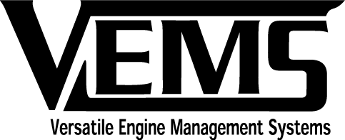
Various vector formats: http://www.vems.hu/files/MembersPage/JorgenKarlsson/Vems_v2.0_vector_files.zip
I feel that it solves all the problems with the original logo and that it still looks 'the same'. The problems with the old logo is that it highlights MS as in megasquirt which is VERY bad and that the original logo was very unbalanced. -Jörgen
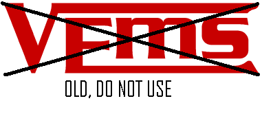
Marcell likes the original better, but we can just send in for cutting from 3..4 colors, a few hundred from each. The vector version is needed. The cutter partner likes postscript. They (for some reason) don't like hundreds of small segments, but prefer longer curves. The original .ps was fine (after manually removing the spelling error "managment" text from the .ps file), while the (from .ps not properly converted) .dwg was not.
Old logo - should not be used on any stickers or new web pages.
VEMS text on the PCB
Color selection
We heard opinions that the diffuse materials are more exclusive than the shiny counterparts. On the shiny surface, you can see some reflection of a direct light-source.
The colors look much nicer in reality than on the scanned image.
- [selection sheet 1] first 3 columns are shiny colors, the last column is diffuse.
- [selection sheet 2] all these colors are diffuse.
![[selection sheet 1]](http://www.vems.hu/files/marketing/Sticker/color_samples/sticker_colors_1.jpg)
![[selection sheet 2]](http://www.vems.hu/files/marketing/Sticker/color_samples/sticker_colors_2.jpg)
In the new batch, metallic is only 30% more expensive than regular colors.
Votes ?
- 8969-00 300x Silver is already ordered (metallic color: between shiny and diffuse)
- 8929-00 300x Shiny-white is already ordered
- ...
Old run:
- red 30% RGB=F00
- black 20% RGB=000
- white 30% RGB=FFF
- green 5% (0% in next run) RGB=0F0
- yellow 5% (0% in next run) RGB=FF0 (needed? looks good on red car)
- aqua 3% (0% in next run) RGB=?
- silver 20% (good on most backgrounds, very popular)
- gold 0% in next run
Who designed this logo? Is it possible to append ".hu" ? It's OK if font is not exactly the same, or if the appended ".hu" is slightly smaller.